
The "X-Rated" logo.
The RaidenX identity was developed around sexuality as one of the artist's defining characteristics. The visual system translates that quality through two complementary elements: the oversized X and the pin-up-inspired silhouette.
The "X" serves as both a direct reference to the artist's name and a subtle association with “X-rated” media, giving the mark an inherently provocative and uncensored quality. Its exaggerated scale and heavy geometric form create a sense of confidence and attitude.
Interacting with the "X" is a stylized female silhouette inspired by pin-up imagery. Rather than functioning purely as sexual decoration, the figure represents confidence, sensuality, and sexual empowerment. Her organic curves contrast with the rigid geometry of the typography, creating visual tension and giving the identity a more expressive personality.
Together, these elements establish an identity that feels bold, provocative, sensual, and unapologetic. These are qualities that reflect the sexual energy at the center of RaidenX's artistic persona.
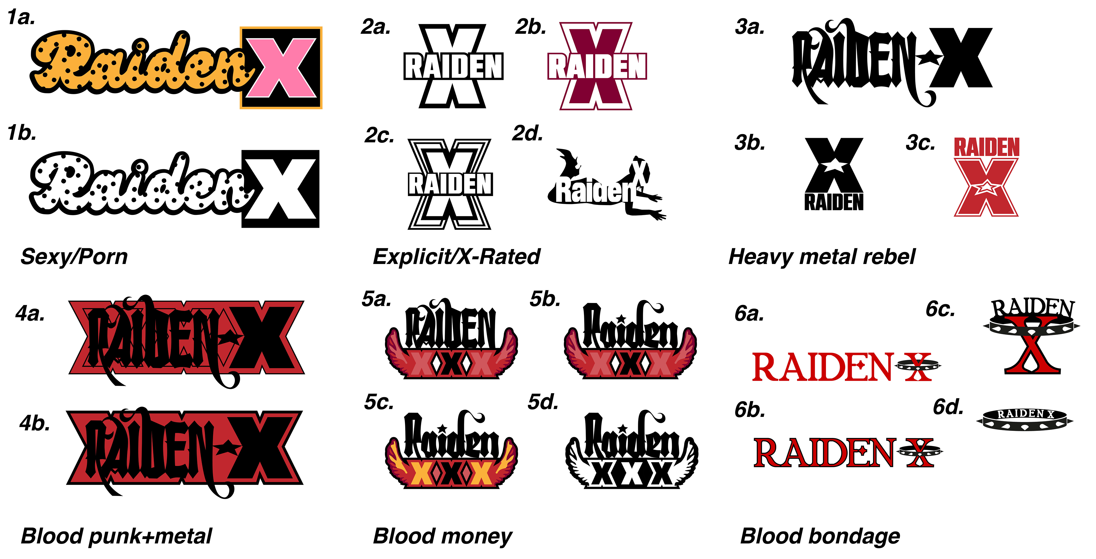
Multiple explorations into drafting logos given the major themes: sex/porn, explicitness, heavy metal, blood and money.
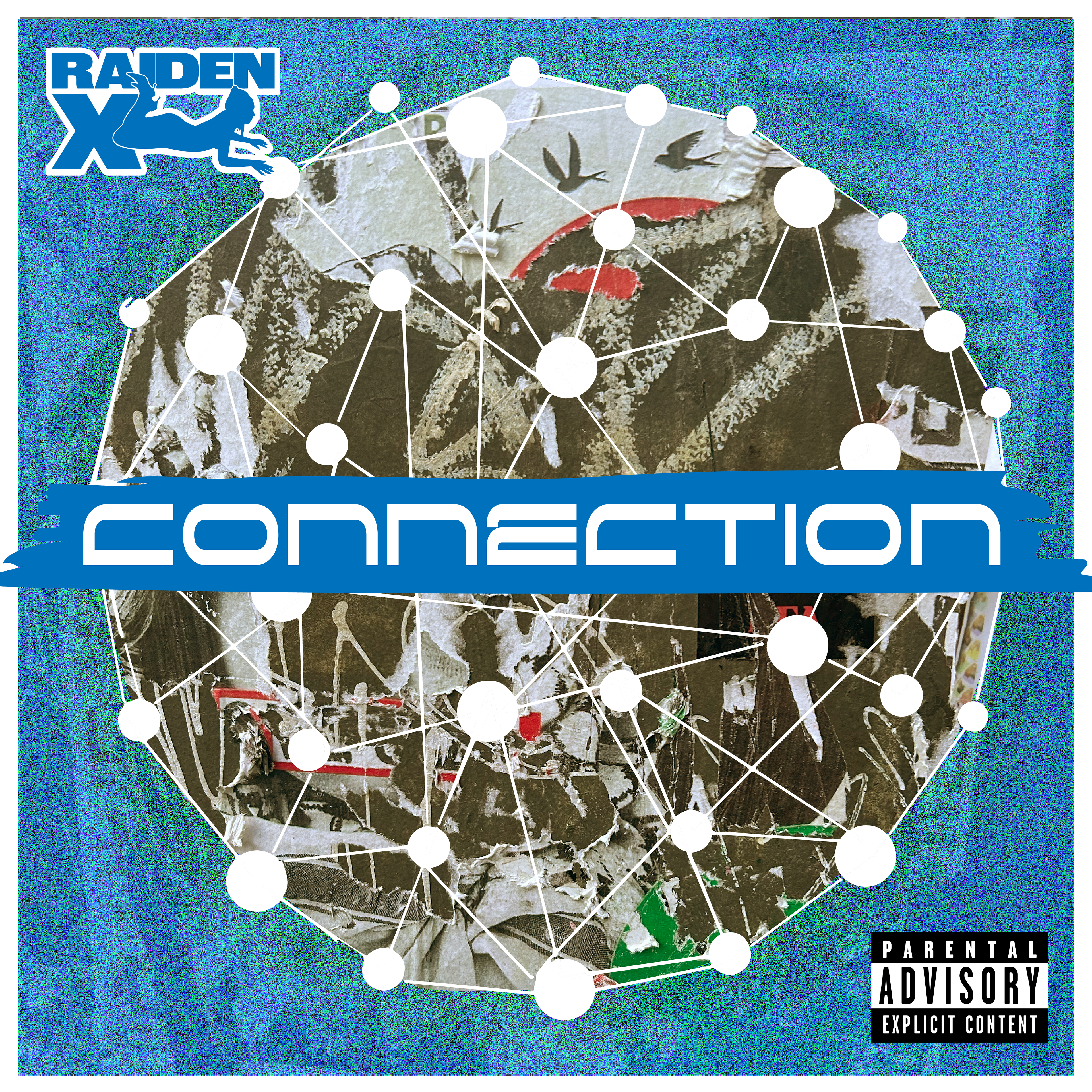
The cover art visualizes “Connection” as a network of individual points becoming a larger, unified system. The interconnected cells and lines create a sense of constant movement and hyperstimulation, while their overlapping relationships communicate how the song blends these many sensory elements into one cohesive experience.
The blue palette reflects RaidenX’s “demure era,” shifting away from the bloody, overtly sexual visual language of the “1619 era” toward something more subdued, earthy, and introspective. The contrast between the chaotic network and restrained palette reinforces the song’s balance between intensity and cohesion.